

Changelog Sep 20, 2026 - Theme Motion, rewound Time Machine charts, and 32 corrected presets
A new dashboard card plays every correlation theme through three metrics at once, scans run at a past date finally draw their charts from that date, and 32 of our 33 preset scanners now match the screen their pages describe.
 Eoin3 min read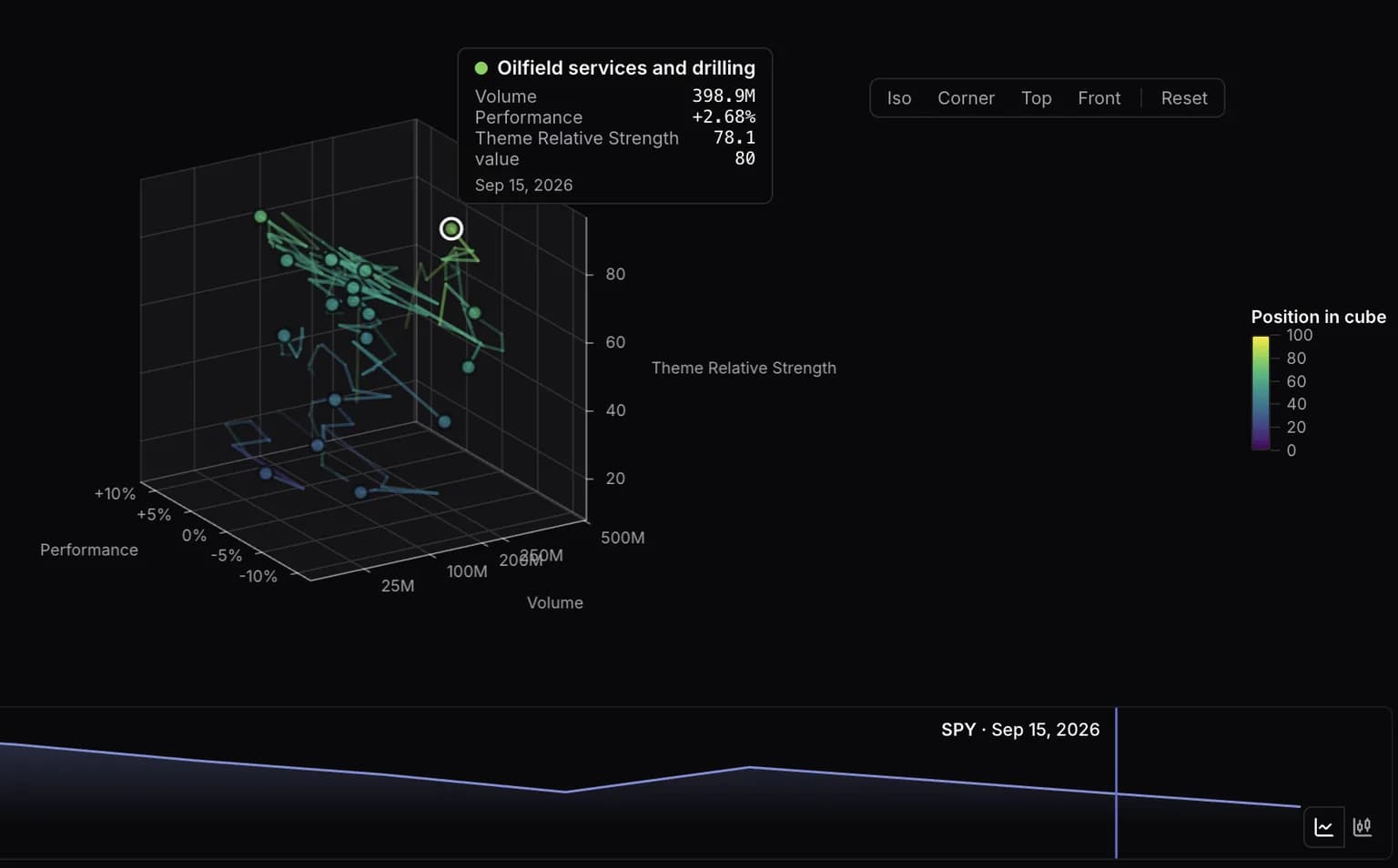
Correlation themes now move. A new dashboard card plays every theme through three metrics at once and scrubs along a stock's price chart. Scans run at a past date draw their charts from that date. And 32 of our 33 preset scanners had drifted from the screen their page described.
Theme Motion
Each theme is a point in a cube, placed on three metrics you choose, and the set plays forward through the history window with a fading trail behind every point. Pick a ticker for the price transport and the playhead runs along that stock's chart instead of a date bar, so you can watch which themes rotated while NVDA broke out. Line or candlesticks, your call.
Colour does a second job if you want one. Set Colour by to an axis and the markers repaint on that metric's scale; set it to Position in cube and they paint on distance from the near corner, reading all three axes at once. The legend turns into a colour bar so colour never claims two meanings.
Add it from the card picker. Theme Motion draws on Super and Super Pro, and a free account gets a preview of what it would show.
Time Machine charts stop where the scan did
An anchored scan returned the names that matched on your date and then drew every chart from today's bars, so a March hammer sat under a September chart. Bars, feature windows, chart patterns and supply/demand zones now stop at the close of the anchor date in New York, the same instant for a reader in Sydney as for one in Manhattan. The window moves rather than clips, so a 1-year chart still spans a year.
Row metrics stay live, because the scan engine has no date bound for them. Web and iPhone both say so beside the results age, and each names why a run could not rewind: more than one anchor date, an as-traded price basis, or a rolling anchor the engine did not resolve. Time Machine runs on Super and Super Pro.
32 corrected presets, and Hot Stocks makes 34
Our preset scanners ship their filter definitions inside the app so the conditions list renders offline. The engine's catalogue edited 32 of the 33 without bumping a version, nothing flagged it, and on 19 pages the conditions list disagreed with the rows printed underneath it.
Every candlestick preset picks up a 50-day average dollar volume gate of $5M and a longer lookback (Hammer 3 bars to 8, Gravestone Doji 3 to 10, four others 3 to 5). Bullish Engulfing and Bullish Marubozu gain the bullish direction they lacked, so they stop matching the bearish form of their own pattern. Small-Cap Breakout loses its insider-buying leg. Seven presets carried no universe and now scan what the official run scans, which narrows them. A saved scan keeps the definition it was saved with, so re-load the preset for the corrected one.
Hot Stocks is the new one: liquid names moving 15% either way, or more than 5% with dollar volume three standard deviations above its own sixty-day norm. It reads today's bar, so the list moves through the session and settles at the close.
Also in this release
- A liquidity floor for theme cards, set once for the dashboard: hide themes whose median member turns over less than $1M, $5M, $10M, $25M or $100M a day. Too little volume data to judge leaves a theme visible with a marker, and the detail dialog shows the median behind the verdict.
- Theme heatmaps printed performance as
0.1where they meant+10%. Web and app. - A row on the Theme Overview card opens the same detail dialog the heatmap does, pinned to that card's date.
- Typing into a ticker search that already held a symbol appended to it:
AAPLplusamgave youAAPLam. It was also hiding correct server results, including name matches like Schaden for AMD. - The unread dot on the notification bell reads as a signal rather than a grey smudge.
- scanr.ai/review picks its destination per reader, and the sidebar carries a Leave a review link. The Play Store ask falls back to Trustpilot until our Android listing goes live.
Theme Motion is the one we most want to hear about, especially which three metrics you put on the axes. Tell us at feedback.scanr.ai or [email protected].
— Eoin & The Scanr.ai team